Weblogs

Turn and Face the Strange

With apologies for two weeks in a row of naval gazey posts about blogging, I’m still playing around with WordPress. I managed to solve the most pressing issues for this initial migration from Movable Type to WordPress and have made the momentous transition from the old blog to the new. As described last week, this has already conferred many benefits, including HTTPS, a better responsive design, and pretty permalinks. That said, there are a few stragglers and other things that I still need to implement.

One thing that has struck me during this process is how easy a fresh installation is versus the challenges inherent in converting an existing site to a new system. This is something that has come up in my professional life as well. After decades of new systems being layered on top of old systems, we’re finally embarking on the process of retiring some of those older systems. It’s a challenging proposition, but the devil is in the details, and the details are all in the transition phase where the system to be retired still exists. Everyone loves designing a new system; no one loves retiring the old legacy systems and all the thrash implied in such an effort. Also, no one wants to lose functionality, just like I didn’t want to lose decades of blog posts and whatever Google juice I might have conjured up.

Look, this blog has never been popular and I’m not under any delusions here, but part of the reason it took so long to make this transition is that I didn’t really want to lose what I’d built up. Most of this was for my own edification, and thus, so is the transition, but at the same time, it wouldn’t be public if I didn’t want anyone to see it.

Anywho, here’s some remaining considerations:

  • Adding Widgets – There are a few things that I used to have on my old blog page that I want to port over here, namely some introductory text and additional links (i.e. the blogroll, etc…) for the sidebar. It shouldn’t be too difficult, but I haven’t looked into it yet and from what I’ve seen, there’s probably some ideal way to do it that won’t involve mucking with design themes.
  • Design Themes – Speaking of which, I’ve chosen a pretty basic design at the moment. One of the benefits of this process is that I should be able to change designs very easily… and there are tons of design themes out there for the picking. Navigating those themes is pretty rough though, and they tend to be very extensible, so even just previewing them can be awkward.
  • Commenting – I played around with this last week and immediately started getting spam. I know the process of commenting on my old blog was awful, but it at least prevented spam. There are, of course, lots of plugins for this sort of thing, so I’ll just need to play around with it. I’ll probably try opening up commenting again today
  • The Beer Blog – I’ve actually set up the WordPress version, which appears to be working well enough. It’s the transition that will kill me here. For some reason, I installed the original beer blog on a subdomain (it’s currently at beer.kaedrin.com). This, of course, does not play nice with WordPress (or, uh, vice versa). That said, I should be able to do something similar to here, which is to write up some regex code for .htaccess file to 301 redirect to the new site. Needless to say, my regex skills are not up to snuff at this point, so I’ll need to do some research and learning. In some ways, it’s nice to learn something technical to solve a problem. In other ways, I just want to get the new version up and running.
  • Various and Sundry Cleanup – While importing all the entries for both blogs was a relatively easy process, not everything survived intact. There’s lots of weird formatting issues strewn about that probably should be cleaned up. That said, the prospect of going through thousands of posts to do such a thing is a bit daunting. But I will probably pick and choose individual posts to be cleaned up here and there.
  • Stone Knives and Bearskins – So once I get all this fancy newfangled blog stuff sorted, I should probably go back and figure out some of the older content on the site (much of which pre-existed the original Blogger weblog, let alone Movable Type or WordPress). Some of it is probably fine to languish in obscurity, but some of it should probably be ported over here. Again, this will involve some sort of republishing and 301 redirects.

So yes, plenty of changes still to come. This process has been both easier than expected and yet some of the difficulties are exactly what I wanted to avoid. Good progress so far though, so let’s keep things moving.
Changes, They Are A Comin’

To the blog. I mean, yeah, sure, the world too (boy, are they!), but this post is about my blog. I’m sorry. It’s been about 4 years since the last refresh, and even that was kicked off accidentally and thus never quite achieved what was truly needed. Since then, additional requirements have come to light, and I figure it’s finally time to take a serious look at the technical foundations of Kaedrin.

Since 2002, this weblog has been powered by Movable Type. At the time, this was pretty much state of the art. It was significantly better than Blogger (the original platform I used) and other competitors at the time (i.e. Greymatter, etc…) WordPress was still three years away, and the initial versions were probably a bit behind Movable Type. For a long while, I feel like the two platforms kept up with each other and the competition was probably good for both. Movable Type even offered an Open Source option under GPL for a while. Alas, WordPress became the standard… but by then, I’d build up a solid decade’s worth of posts and the transition seemed like a lot of work for little benefit.

Well, things have changed a bit. Movable Type retired their Open Source version and basically priced individuals out of the software. I’ve mostly limped along since then, never really finding the time or motivation to seriously fix some of the issues. I could certainly continue on this path, but there are a few things I’ve wanted to do for a while now and it seems like WordPress would be a much better (and more sustainable) option for the future. You know, the one where people still care about and read blogs?

So anyway, after 18 years of service, I’m planning to retire Movable Type. Take a bow. Yeah, I probably should have made this transition a decade ago, but for all its faults, MT has served me well. So, what are the reasons I’m making this change? Here’s a few things:

  • HTTPS – Security has become more and more important over the years and somewhat recently, browsers and search engines have started penalizing sites that don’t use TLS/SSL. There are ways to do this on MT, but WordPress appears to be much easier.
  • Pretty Permalinks – Back in 2002, the only option for permalinks was to just use the numerical post id in the URL. A while later, the standard changed to using something more descriptive and while MT offered that option, I’d built up enough history that the change wasn’t as easy, and then it only got worse as time went on. So while I’m updating to HTTPS (which counts as a URL change), I might as well switch to a better, more descriptive permalink. More about how I’ll achieve this below…
  • Responsive Design – I technically already have this, but as already mentioned, it’s barely functional. In general, the design of Kaedrin has degraded a bit over time, and one of the things that WordPress is really good at is allowing quick and easy theme changes. They have a massive library of thousands of designs to choose from, while MT has, like, a dozen (maybe, I’m not checking). Now, the process of browsing and choosing a design theme leaves a lot to be desired, but I think I’ve found a few that could be interesting (and many allow for enough customization that it’ll be fine).
  • Comments – It’s possible to comment here, but man I’ve made it obnoxious to do so, haven’t I? Well, there are plenty of limitations on the MT side and it relied on some third party services that are no longer working (particularly, Google’s OpenID system broke again a few years back after I managed to briefly fix it). In any case, WordPress seems to have a much better way of capturing comments and their anti-spam measures are also better.
  • Support – In general, WordPress has a much better support community. This is also why it has so many design themes and plugins.

And there’s plenty of other reasons. You may have noticed that everything looks the same, and that’s because the transition hasn’t quite happened yet. So why isn’t this fancy new blog shooting into your eyeballs right now? What have I done and what’s left to do?

  • Installation – Installation was a breeze, actually. Only minor little kerfluffles here and there. WordPress is actually powering the main kaedrin.com page right now. It’s not much to look at, but now I’ve got some more options.
  • Importing Posts – Also a relatively simple process. There was one snag, which had to do with the CONVERT BREAKS indicator not being imported properly, but a quick google search for “wordpress movable type import line breaks WHY THE FUCK WON’T IT WORK” yielded a good solution. The only other annoying thing was that the importer can only work on files that are 1 MB or less. Believe it or not, this blog exports to a 12 MB file, so I had to spend some time splitting up the files and importing in batches. But all in all, it was a pretty easy process.
  • Stupid Rewrite Engine – So WordPress does this thing where it uses .htaccess rewrite rules to run the entire URL structure. Which, like, sure, it’s probably better than MT’s static HTML files, but it’s also not nearly as flexible in terms of where you can publish your blog. In particular, since this “weblog” directory already exists, WordPress has difficulty displaying the main page (everything else works fine – I can go to individual posts, archives, etc… with no problem). If you came here in the last few days when I’d been playing with this, you may have seen the main blog page show a 403 error (and you may see that again as I work out kinks). Now, the grand majority of users probably aren’t migrating 20 years of posts and are, in fact, just starting something new and thus won’t experience any issues. But after a few decades and several content management strategies, my directories are a bit of a mess, which causes issues with WordPress’ rewrite engine. It’s nothing insurmountable, but it will take some time to resolve.
  • 301 Redirects – Basically, I need to set this up for every blog post (I’m less concerned about Monthly/Category archives, etc…) There are easy ways to do this and I think there might be a way to do it in bulk, I just need to figure it out. I was hoping that the new and old blog could coexist for a while so that I could do a more leisurely transition, but this may ultimately be for the best anyway…
  • Updating Manual Links/Images – There may be some weirdness in the beginning as some of the old links and images are hardcoded into entries. The 301 redirects should function for the links, but it’s not a good practice to keep them in place; they should be updated to the new URL structure. I should be able to fix the majority of these using find/replace capabilities in WordPress, but again, some weirdness may persist in the archives.
  • The Beer Blog – I haven’t even started on the beer blog, but I’m anticipating basically the same problems there. Not only does that directory already exist (thus probably breaking the rewrite engine), but I also made that directory a sub-domain (again, WordPress’ lack of flexibility in terms of publishing makes this problematic). I’m also shuddering about the thought of reorganizing all the categories there (the import process flattens the category hierarchy – I’m hoping there’s a plugin that allows for better category management, I just haven’t looked yet).

There’s still plenty left to do, but it all seems more approachable than I had feared. A big part of this is the huge ecosystem of plugins and support that WordPress has built up (and that is practically non-existent for MT). I’m hopefully that the new blog will be up and running for the 20th anniversary of the weblog (while Kaedrin existed in various incarnations before the weblog, the first post here was on July 14, 2000). Until then, stay safe and healthy out there folks.

Update 6/30/20: The changes have come and are blasting into your eyeballs as we speak. Turn and face the strange. Moar to come.

Safe and Constructive

I’ve been writing this blog for almost 20 years now and while I’ve touched on politics from time to time, it’s not a strong point and I’ve found that while arguing about stuff on the internets can be productive at times, these days it just makes me angry. Social media doesn’t help. With all due respect to Twitter and Facebook, they’re awful platforms for these sorts of discussions. They’re optimized for “increased engagement” but that basically amounts to algorithms that seek to obliterate nuance and sow discord.

A couple of months ago, as the world went into various forms of lockdown to fight a pandemic, I thought maybe blogs could make a comeback. That’s somewhat naive, I guess, and it’s not like some blogs weren’t a cesspool, but they were at least easily isolated or avoided cesspools. Social Media only occasionally scratches that blogging itch, but it’s too easy to mix garbage into your feed (or to have an algorithm insert garbage into your feed despite explicitly rejecting to follow someone, etc…) It’s a signal vs noise problem, and the algorithms find that noise actually increases engagement, so it’s encouraged.

It reminds me of that scene in Private Parts where they’re going over Howard Stern’s ratings and they’re like “The average radio listener listens for eighteen minutes. The average Howard Stern fan listens for an hour and twenty minutes.” and they’re like “That’s amazing, but what about the people who hate him?” and the response is “Good point. The average Stern hater listens for two and a half hours a day.” People like to be angry I guess, and social media is built around that concept.

Mad

If there’s one recommendation I can make right now, it’s to at least be aware how this sort of thing works. I don’t think you need to avoid social media altogether (though it may be a good idea to take breaks from time to time!), so long as you are thinking critically about what you’re seeing. Anger is a natural and legitimate response to a lot of things in this world (what happened to George Floyd, for instance), but social media’s goal is to increase engagement by stoking that anger into something less focused and unproductive.

Look, anger can prompt action, but it can also end in counterproductive events or, strangely, apathy. I’m not very productive when I’m angry (or, I should say, that kind of angry), which benefits no one. We’re living through an unprecedented mixture of upheavals ranging from a pandemic to police officers committing murder to protests to antifa to looting to curfews and much more. No one reads this blog and to be honest, my “in the moment” analysis isn’t going to be very productive, but I’m reading and thinking and trying to find core issues and ways to support needed change (justice for George and I’m glad the police officer in question has been arrested and charged, but it goes far beyond that). I’m angry, but I’m trying to find ways to contribute that will actually help. As are most people! Another failing of social media is that it amplifies the most divisive voices even what the grand majority of people can all agree on a given issue.

For the record, some bullshit Executive Order isn’t going to “solve” social media. I’m critical of social media in this post, but it also contains value, and improvements to social media probably won’t come from government. The only way to “solve” social media is for its users to be more aware of what those platforms are and how they react to it. A lot of the best parts of the internet are also its worst parts, and it’s important to understand how that works.

All of which is to say: be safe and constructive out there, people. It might seem impossible, but we can get through this stronger than before. Change happens incrementally, and while it might seem like small victories aren’t enough, they can add up and build a base for larger change. But we have to want that. We’re trying to move mountains here, it won’t happen overnight. Being angry on social media isn’t going to get it done. Only a few people read this (or, for that matter, my social media accounts), but if you are reading this, I will repeat: stay safe and constructive.

Movable Type and Commenting Woes

Many moons ago, I heard about this new thing called a “weblog”. A new site had popped up called Blogger, and it was the coolest thing evar. It had a hip startup mentality, and it was going to, like, totally change the world. I immediately signed up and used it for a couple years. Keep in mind, I’m talking turn of the century timeframe here, so blogging software options were extremely limited (basically just Blogger and whatever homegrown stuff you could cobble together). I used Blogger for a couple years, until their explosive growth lead to slow load times and unreliable FTP service (a few years after that, they got bought out by Google, and their stability problems suddenly vanished. Incidentally, the founder of Blogger went on to found a couple other businesses, including something called Twitter. Good for him.). At the time, options were still limited, but a new startup seemed promising. It was called Movable Type, and it was fully featured (certainly an upgrade from Blogger’s original functionality) and free. I jumped at the software and have been, more or less, pretty comfortable with it since then.

It’s been over a decade, and in that time, Movable Type has treated me rather well, despite the emergence of a rather popular competitor in the Open Source WordPress. In fact, WordPress has pretty well eaten Movable Type’s market, to the point where they’re currently retreating up market, catering to enterprise clients like Huffington Post. For a while, it wasn’t that big of a deal. Indeed, they even released an open source version of Movable Type. However, about a year ago, they shifted focus dramatically. Open Source options were set to expire and the individual blogger license was set to go away, replaced by a ridiculously overpriced option (effectively leaving amateurs like myself out in the cold).

My problem? The Google login for comments seems to have stopped working for some reason. No obvious fixes have presented themselves. I’ve upgraded Movable Type to the latest Open Source version available, but that has not resolved the issue (in fact, it actually broke things further, though I figured out that issue pretty quickly, leaving me back where I started). This makes me want to jump ship and hit up WordPress. But then, I’m 14 years into this and maintain two blogs with over 3000 entries, copious meta-data (as bad as the categories are here on my generalist blog, my beer blog has a pretty comprehensive categorization scheme), and nearly as many comments. I’m sure many folks have it much worse, but it still seems daunting.

Simply migrating to WordPress would be rather difficult (hell, just transferring my current data into a local version of MT running on my Ubuntu box was a huge pain in the arse). It’s certainly possible, but even in the best case, I’m likely to lose any SEO benefits I’ve accrued throughout the years, not to mention the hassle of actually getting the data to load (I can pretty much guarantee that various timeouts and permissions will have to be overridden in order for all that data to be transferred). There are ways around this, but it would be a huge hassle. My best case would probably be to commission a hired gun to make the transfer go smoothly, but I’m sure that’s still going to be a painful transition.

All of this is to say that comments aren’t working quite right these days. In particular, the Google login seems to be failing for some reason. WordPress and Yahoo (and other options) seem to work fine, but Google is clearly the option used by the majority of commenters here. Anonymous commenting hasn’t been an option for a long time (the last time I enabled anonymous commenting, even with a captcha, I received about 5000 spam comments in just a few hours). I tried enabling User Registration (where you could actually register an account here at Kaedrin), but for some reason, the email confirmation isn’t working properly. I will probably take a swing at this over the next few weeks, but I wouldn’t hold my breath. My days of hacking all this blogging software stuff are long gone, and I’m not really into the hassle so much these days. Maybe I’ll figure it out. Or maybe a long overdue transition to WordPress is in the cards. We’ll see where it goes, but for now, just note that the Google login for commenting isn’t working so well. Sorry for any inconvenience. Personally, I blame spammers. Those assholes made commenting and trackbacks a total nightmare to deal with. Stay with me here, I’ll figure something out eventually. In the meantime, feel free to email me at tallman_at_kaedrin.com (see, I even need to remove the @ symbol from my email, least I get bombarded with spam) if you want to comment on anything (or use a WordPress login, which seems to work fine).

Zemanta

Last week, I looked at commonplace books and various implementation solutions. Ideally, I wanted something open and flexible that would also provide some degree of analysis in addition to the simple data aggregation most tools provide. I wanted something that would take into account a wide variety of sources in addition to my own writing (on this blog, for instance). Most tools provide a search capability of some kind, but I was hoping for something more advanced. Something that would make connections between data, or find similarities with something I’m currently writing.

At a first glance, Zemanta seemed like a promising candidate. It’s a “content suggestion engine” specifically built for blogging and it comes pre-installed on a lot of blogging software (including Movable Type). I just had to activate it, which was pretty simple. Theoretically, it continually scans a post in progress (like this one) and provides content recommendations, ranging from simple text links defining key concepts (i.e. links to Wikipedia, IMDB, Amazon, etc…), to imagery (much of which seems to be integrated with Flickr and Wikipedia), to recommended blog posts from other folks’ blogs. One of the things I thought was really neat was that I could input my own blogs, which would then give me more personalized recommendations.

Unfortunately, results so far have been mixed. There are some things I really like about Zemanta, but it’s pretty clearly not the solution I’m looking for. Some assorted thoughts:

  • Zemanta will only work when using the WYSIWYG Rich Text editor, which turns out to be a huge pain in the arse.  I’m sure lots of people are probably fine with that, but I’ve been editing my blog posts in straight HTML for far too long. I suppose this is more of a hangup on my end than a problem with Zemanta, but it’s definitely something I find annoying.  When I write a post in WYSIWYG format, I invariably switch it back to no formatting and jump through a bunch of hoops getting the post to look like what I want.
  • The recommended posts haven’t been very useful so far. Some of the external choices are interesting, but so far, nothing has really helped me in writing my posts. I was really hoping that loading my blog into Zemanta would add a lot of value, but it turns out that Zemanta only really scanned my recent posts, and it sorta recommended most of them, which doesn’t really help me that much.  I know what I’ve written recently, what I was hoping for was that Zemanta would be able to point out some post I wrote in 2005 along similar lines (In my previous post on Taxonomy Platforms, I specifically referenced the titles of some of my old blog posts, but since they were old, Zemanta didn’t find them and recommend them.  Even more annoying, when writing this post, the Taxonomy Platforms post wasn’t one of the recommended articles despite my specifically mentioning it. Update: It has it now, but it didn’t seem to appear until after I’d already gone through the trouble of linking it…) It appears that Zemanta is basing all of this on my RSS feed, which makes sense, but I wish there was a way to upload my full archives, as that might make this tool a little more powerful…
  • The recommendations seem to be based on a relatively simplistic algorithm. A good search engine will index data and learn associations between individual words by tracking their frequency and how close they are to other words.  Zemanta doesn’t seem to do that.  In my previous post, I referenced famous beer author Michael Jackson. What did Zemanta recommend?  Lots of pictures and articles about the musician, nothing about the beer journalist. I don’t know if I’m expecting too much out of the system, but it would be nice if the software would pick up on the fact that this guy’s name was showing up near lots of beer talk, with nary a reference to music. It’s probably too much to hope that my specifically calling out that I was talking about “the beer critic, not the pop star” would influence the system (and indeed, my reference to “pop star” may have influenced the recommendations, despite the fact that I was trying to negate that).
  • The “In-Text Links”, on the other hand, seem to come in quite handy. I actually leveraged several of them in my past few posts, and they were very easy to use. Indeed, I particularly appreciated their integration with Amazon, where I could enter my associates ID, and the links that were inserted were automatically generated with my ID. This is normally a pretty intensive process involving multiple steps that has been simplified down to the press of a button.  Very well done, and most of the suggestions there were very relevant.

I will probably continue to play with Zemanta, but I suspect it will be something that doesn’t last much longer. It provides some value, but it’s ultimately not as convenient as I’d like, and it’s analysis and recommendation functions don’t seem as useful as I’d like.

I’ve also been playing around with Evernote more and more, and I feel like that could be a useful tool, despite the fact that it doesn’t really offer any sort of analysis (though it does have a simple search function). There’s at least one third party, though, that seems to be positioning itself as an analysis tool that will integrate with Evernote.  That tool is called Topicmarks.  Unfortunately, I seem to be having some issues integrating my Evernote data with that service. At this rate, I don’t know that I’ll find a great tool for what I want, but it’s an interesting subject, and I’m guessing it will be something that will become more and more important as time goes on. We’re living in the Information Age, it seems only fair that our aggregation and analysis tools get more sophisticated.

Enhanced by Zemanta

State of the Blog

Hard as it may be to believe, this blog is coming up on its 11th anniversary. In other words, I’ve been blogging for more than a third of my life, and all of my adult life. Of course, the blog has seen varying levels of activity over the years, but has remained remarkably consistent over the past few years, largely due to my Sunday/Wednesday schedule. Anywho, I thought I’d take a look at the past year of statistics and see what that shows me. Some generic stuff:

  • 36,815 Visits
  • 54,408 Pageviews
  • Approximately 75% of traffic comes from search engines (approx. 62% of total site traffic comes from Google)
  • The remaining 25% are split between referring sites (13%) and direct load (12%)

Now, I have set up my analytics software to ignore me, and this is mostly successful, though there are definitely times when the cookie gets cleared somehow, so I’m sure some of the above is me. But you’re not seeing the full brunt of my obsessive site-checking.

So what are the most popular pages?

  • Weblog main page is obviously the biggest winner here, with 18% of pageviews
  • Time Travel in Donnie Darko seems to be the most popular single entry on the blog. Google seems to be the biggest referrer, though I do frequently see people coming from facebook.
  • Samoas vs Caramel DeLites is also quite popular. The interesting thing about this one is that it only really gets traffic in January, February, and March (i.e. when Girl Scout cookies are sold). Facebook and other referring sites seem to make up a bigger percentage of the referrers for this one…
  • Sins of a Solar Empire: Lessons Learned, Sorta is a funny one to be popular, as I suck at that game. It’s what’s known in the biz as a “PC ass PC Game”, meaning that it’s ridiculously complicated, with a huge learning curve and a crappy tutorial. Apparently this post has a great google ranking for people looking for a guide to the game (of which the post really isn’t).
  • Cowboy Bebop: The Ending is also a popular post, presumably because I’m so brilliant.
  • A Reflexive Media gets a bunch of traffic as well, usually from folks looking to understand Reflexive Documentaries.
  • Bear Pajamas gets a ridiculous amount of traffic given the trivial nature of the post (about how a character in an Anime wears Bear Pajamas)
  • Neal Stephenson Category Archive gets a nice amount of traffic, which isn’t all that surprising.
  • Interrupts and Context Switching gets some love too, which is reassuring, as it’s one of my favorite posts.

Mind you, those are only blog posts I’m referencing. Older stuff from the pre-blog days still gets a lot of traffic too, most notably my in-depth review of Hitchcock’s Rear Window and my Guide to Isaac Asimov (which I wrote when I was a teenager and should probably revise at some point, as it’s pretty embarrassingly bad).

I’ve definitely settled into a bit of a groove on the blog, and I can tell you that I spend less time writing posts these days. I have mentioned a few times that I need to shake things up a bit, but I have had limited success with that. I’ve generally noticed that my posting goes in waves. Sometimes I’ll be inspired and have no problem writing new, interesting stuff. Other times, not so much (which is when you get simple posts like a link dump or something). Yeah, this isn’t exactly an earth shattering observation, but still. In reality, I tend to be pretty hard on myself when I’m in the midst of writing – I’m usually not super happy with a post when I publish, but if I revisit later, I’m often surprised by what I wrote. I usually like it a lot more after the fact. Go figure. In any case, the blog must go on, even if it does get stuck in a rut every now and again (hopefully, it’s at least an entertaining rut!)

A Decade of Kaedrin Weblog

Believe it or not, it’s been ten years since I started blogging here. Sure, I started the website even before then and the blog has changed a lot since those initial entries, but it’s still an important milestone. Going back to read those first posts is a bit painful, what with the embarrassing attempts at humor and reliance on some of the lame weblog tropes of the day, but I’m ultimately pretty happy with my blog.

In the beginning, I had focused on smaller entries and reached a peak posting rate of just a little less than one a day. However, this was unsustainable, especially if I didn’t just want to keep repeating stuff that other people were posting. From there, things floundered a bit for about a year or two until I set a weekly schedule for myself, committing to at least one entry a week (on Sunday). The thought was that having a regular posting interval would make it easier on readers, who would know when to expect new content. The schedule was later amended to include at least two entries a week, and I’ve kept to that schedule pretty well over the past several years.

I’d also like to think that the quality of my writing has improved, though I have to say that I feel like I’ve been a bit of a funk lately. I’ve been relying on formulaic and not terribly inspired posts like link dumps and doing less writing of consequence. More and more it seems like I don’t really have a good idea what I’m going to write about when I sit down on Wednesday or Sunday, and all too often, I end up firing out an entry in about an hour or so (this post will probably fall into that category, though I knew I wanted to write it). These entries often come out better than I thought at the time, but they’re still not my best work. I’ve been blogging long enough to recognize that this sort of thing happens from time to time though, and I often feel better after a few months, so I’m not looking to make any drastic changes. I considered taking some time off to see if my brain would recharge or reconfigure itself or something, but I think whatever success I’ve had with this blog has been due to my schedule. Plus, I do have some longer and more involved pieces in the works, so hopefully I’ll be able to polish some of those off soon…

One of the interesting things about running a blog for so long is that I’ve developed some strange habits. For instance, I often find myself thinking about whether or not something I’m doing or watching or reading is blog-worthy. A lot of people blog because they have something to say or because it’s timely and relevant, and I suppose I do that too, but I also blog to learn about things that interest me. Most current events don’t really fall into that category until after the fact (if at all). But I am, of course, interested in lots of things and even writing a quick post on a complex subject can lead to deeper understanding. Writing a a longer form essay often takes me to all sorts of interesting places that I never even intended to visit when I started writing, and those end up being my favorite posts. Usually such posts burrow into my mind and grow follow-up posts (which is perhaps another thing that only a blogger could appreciate).

In the ten years I’ve been running the blog, I’ve never really had that large of an audience. I’ve had a small and loyal following, and for those readers I am very grateful, but this blog was never entirely about that. Of course, the blog is public, and so I do very much appreciate whatever limited attention I get, but it’s always been more about what interests me at any given time, and often that doesn’t lend itself to the sort of thing that make blogs popular (i.e. timely events and controversial stances in short, easy to read chunks, etc…). This isn’t a complaint, as I don’t think I’d enjoy having a tremendously popular blog; that entails all sorts of other frustrations that I’d rather not deal with.

In any case, since I’ve already done a detailed look at the history of the site, I figure there’s not much to say at this point. I realized that I hadn’t updated the Best Entries category in a few years, so I added a bunch of posts I thought worthy (if you have any favorites of your own, let me know) and hopefully I’ll be writing many more posts that belong there in the future. Just for the heck of it, here are some of my favorite posts from the past year or so:

And I think that about wraps it up for now.

A Decade of Kaedrin

It’s hard to believe, but it has been ten years since I started this website. The exact date is a bit hard to pinpoint, as the site was launched on my student account at Villanova, which existed and was accessible on the web as far back as 1997. However, as near as I can tell, the site now known as Kaedrin began in earnest on May 31, 1999 at approximately 8 pm. That’s when I wrote and published the first entry in The Rebel Fire Alarms, an interactive story written in tandem with my regular visitors. I called these efforts Tandem Stories, and it was my primary reason for creating the website. Other content was being published as well – mostly book, movie, and music reviews – but the primary focus was the tandem stories, because I wanted to do something different on an internet that was filled with boring, uninspired, static content homepages that were almost never updated. At the time, the only form of interaction you were likely to see on a given website was a forum of some kind, so I thought the tandem stories were something of a differentiator for my site, and it was, though I never really knew how many different people visited the site. As time went on, interactivity on the web, even of the interactive story variety, became more common, so that feature became less and less unique…

I did, however, have a regular core of visitors, most of whom knew me from the now defunct 4degreez message boards (which has since morphed into 4th Kingdom, which is still a vibrant community site). To my everlasting surprise and gratitude, several of these folks are still regular visitors and while most of what I do here is for my own benefit, I have to admit that I never would have gotten this far without them. So a big thank you to those who are still with me!

But I’m getting ahead of myself here. Below is a rough timeline of my website, starting with my irrelevant student account homepage (which was basically a default page with some personal details filled in), moving on to the first incarnation of Kaedrin, and progressing through several redesigns and technologies until you got the site you’re looking at now (be forewarned, this gets to be pretty long, though it’s worth noting that the site looked pretty much like it does today way back in 2001, so the bulk of redesigning happened in the 1999-2001 timeframe)…

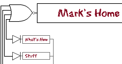
  • 1997-1999: As I started to take computer programming courses in college, I gained access to a student account on the university website. By default, all student accounts came with a bare-bones homepage which we were encouraged to personalize. I never really did much with it, though I thought it was funny to see some of the courses I was taking back in the day: MAT 1050 – Who cares about math, and HIS 3140 – The History of the spork. Also of note, the fact that we referred to it as “electronic mail address” and that google was not on my radar yet… Sometime during this timeframe I started considering a more comprehensive “homepage” and made a few stabs that never really got beyond the photoshop stage (thankfully for you!). Among these ill-fated designes included the uber-nerdy logic gate design shown below (click for larger, more complete version):

    Old, bad, nerdy design

    I’m not really embarrassed so much at the logic gate aspect of the design (which I thought was mildly clever at the time) as the font choice. Gah. Anyway, it was during this timeframe that the first designs for a site called Kaedrin started. The first drafts of the now iconic (well, to me) Kaedrin logo were created during this timeframe. They were not used, but every logo since then has used the same Viner Hand ITC font, though these days the logo isn’t quite as prominent as it once was (as you’ll see below).

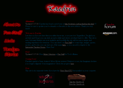
  • May 1999 – Kaedrin v1.0: Again, I’ve had difficulty pinpointing the exact date when I launched Kaedrin in earnest, but judging from the timestamp of the first entry in The Rebel Fire Alarms, I gather that the site had been fully launched in May of 1999 (just as I was finishing up the semester and had some free time on my hands). Thanks to my participation on 4degreez.com (which may have been known as the T.A.S. Boards at the time, I don’t remember exactly), I immediately had a built-in audience of like 5 people, which was pretty cool at the time. That summer was filled with updates and content (this was before blogs, so updates came in the form of reviews for books, movies, and music amongst other stuff that was popular on the web at the time, like sound clips and funny pictures, etc…). The layout initially featured mostly red text on a black background, but I found that to be a bit hard on the eyes, so in August I tried to soften the colors a bit (though even the new color scheme was pretty tough on the eyes). I can’t seem to find an example of the full red on black, but here’s the tweaked version (Click the image to see the full HTML page).

    Kaedrin: Version 1.0

    For the full effect, you have to click through to the HTML page and mouse over the left-navigation. Back in the day, CSS support was minimal, so to do those rollovers I had to write a custom javascript. I don’t think any of the links off the page will work, but it’s worth viewing just for the fun of it. Also worth noting: the copyright logo animated gif thingy and the fact that I had a guestbook (which was all the rage back in the day). Finally, if you have a high resolution monitor today, it’s difficult to notice, but at 800×600 the Kaedrin logo is enormous!

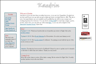
  • May 2000 – Kaedrin v2.0: After graduating college and initiating a job search, I decided that the old homepage design wasn’t very professional looking. During the course of my Senior year, I had spent time learning and thinking about usability and accessibility, and my site at the time was not especially great in those respects (i.e. I figured out for certain that dark red and blue text on a black background was a bad thing). Also, being stuck with a modum connection (after the school’s snappy T3 lines) made me more acutely aware of page loading speeds (and the old page was rather image heavy). So I came up with a much cleaner and simpler design (Click the image to see the full HTML page).

    Kaedrin: Version 2.0

    This was certainly an improvement and when I eventually did find a job, my boss mentioned that she liked my site, so mission accomplished, I guess. Unfortunately, a “much cleaner and simpler design” also meant a more boring design, so it wasn’t long before I started fiddling around with the layout again. This was a little vexing because I was maintaining all of the pages on the site by hand, and converting to the new layout was a monumental pain in the ass. As such, many of the design tweaks made during this (rather short) era were inconsistent throughout the site.

  • July 2000 – Kaedrin Weblog launched: The summer of 2000 is also when I discovered weblogs (the yellow-heavy designs of dack and kottke were my first exposure to the world of weblogs) and the relatively new Blogger. I remember being amazed at the fully featured blogging software that these crazy Pyra people were giving away for free! It’s easy enough to pinpoint my first blog entry, but to be perfectly honest, I’m not sure what the design of the blog was like. It was probably something along the lines of the v2 design, but I’m also virtually positive that the v3.0 design was pioneered on the blog, due to the fact that Blogger was something of a light CMS in that I could tweak the design for all blog pages rather easily. I do vaguely remember having a lot of issues with my free web-hosing company (at the time, I believe it was someone called “redrival”), and in particular their ftp sucked. I think there was a time when I would write an entry on Blogger, publish it to one free host, then transfer the code over to the new host. This is perhaps part of why the initial months of the blog were somewhat sparse in terms of entries, but things got going pretty well in September 2000 and I posted a record-high 29 posts in December 2000.
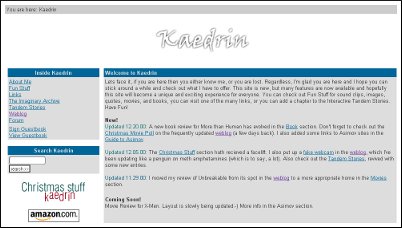
  • November 2000 – Kaedrin v3.0: Due to the blandness of the the v2.0 site and the fact that Blogger provided easily updatable templates, I came up with a different design. It was still clean and simple and ultimately it didn’t last too long because it was still pretty boring. In fact, I’m pretty sure I never got around to updating the entire site. Just the homepage and the blog got this new design. (Click the image to see the full HTML page).

    Kaedrin: Version 3.0

    Ultimately not that much different than v2.0 (I suppose you could consider it more of a v2.5 than a new version, but then it’s probably different enough). It’s still got the big honkin Kaedrin logo, but for some reason I liked this better.. and there’s also the first appearance of the “You are here” bar at the top of the page. While I liked this design better than v2.0, I wasn’t very happy with it and almost immediately started working on something new. I was also getting pretty well fed up with hand coding all these pages for what amounted to minor layout tweaks. One thing that helped in that respect was Blogger, which worked like a CMS-lite, allowing quick and easy layout changes with the click of a mouse. Here is the first design for the blog that I could find. (Click the image to see the full HTML page).

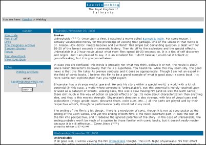
    Kaedrin Weblog

    Interestingly, it seems that I decided to forgo the Kaedrin logo in favor of a little HTM text thingy. Also, I had completely forgotten about the blog’s original subtitle, which could use some explaining. Back in the 1990s it was popular to use “handles” instead of your real name. When I first started posting to message boards and the like, I absent-mindedly chose the moniker “tallman” because I was a big fan of a certain cheesy 1970s horror movie that featured a character who went by that name. Since a lot of popular blogs at the time had playful titles like Boing Boing and the like, I went with “The Royal Kingdom of Tallmania”. I have no idea what possessed me to do that, and it wasn’t long before the subtitle was dropped in favor of just “Kaedrin Weblog”.

  • January 2001 – Kaedrin.com and v4.0: After dealing with the hassle of free hosting companies, I finally realized that I had a steady income and could probably afford a professional hosting service and a real domain, so I bought kaedrin.com and started work on a new design. Fed up with manually coding redesigns, I devised a kludgey XSLT solution that allowed me to completely separate content from design. So I put all my content into XML files and coded the new design into some XSL stylesheets. This design may look somewhat familiar (Click the image to see the full HTML page):

    Kaedrin Version 4.0

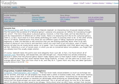
    Being obsessed with download speeds and page rendering, I devised an interesting layout for the blog. Instead of using the typical single-table design, I put the blog navigation at the top (instead of to the left or right) and I put each entry in it’s own table. The idea was that browsers render content as it’s downloaded, and if you have a large table with a lot of content, it could take a while to load. So having a series of smaller tables on the page, while increasing the size, also make the page seem to load quicker. All in all, I rather liked the look of this layout, though I don’t think it’s something I’ll be returning to at any point (Click the image to see the full HTML page):

    Kaedrin Weblog

    While I like what I was able to do with that navigation at the top, I think there were ultimately more things that needed to go into the navigation and that space just couldn’t fit it. I broke down and put it all in a big table in later designs (see below).

  • July 2002 – Movable Type: After a couple of years, I had finally gotten fed up with Blogger’s centralized system. Blogger was growing faster than they could keep up with, and so the service was experiencing frequent downtime and even when you could access it, it was often mind-numbingly slow. Around this time, a few other solutions were becoming available, one of which was Movable Type (I started with version 2.x – also, it’s worth mentioning that WordPress was not available yet). This solution increased functionality (most notably bringing comments into the fold) and provided a much stabler system for blogging. The design changed to take advantage of some of this stuff and to make my blog more consistent with certain blogging standards. This one should look really familiar (Click the image to see the full HTML page):

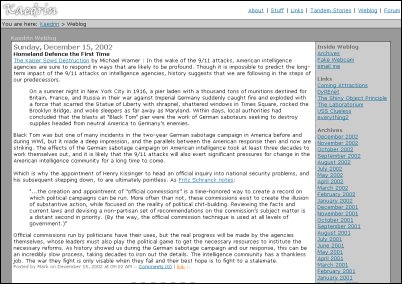
    Kaedrin Weblog - Powered by Movable Type

    That’s basically the same design as today, except for the date and some of the junk in the right navigation.

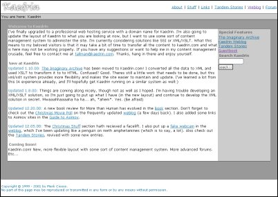
  • And from there it was a series of tiny, incremental improvements, upgrades, and design tweaks. It’s funny, I didn’t realize until now just how little the site has changed since 2002. Also funny: the fact that I had finally devised a way to make redesigns a lot easier (i.e. my xslt solution) and basically stopped redesigning. Then again, it came in really handy when I wanted to do some little things. For instance, the original v4.0 design didn’t have the same borders around the main content area that I use today (it did have a small border at the top of the area, but it was barely noticeable and it was coded using spacers – yuck). I suppose the grand majority of the work that I’ve done has been behind the scenes: upgrading software, switching databases, fighting spam, and did I mention upgrades? In 2004, the main homepage was updated to account for the fact that the grand majority of the updates on the site were coming from the blog, and the design has remained largely unchanged since then. Around the same time, I tried to make sure the blog and homepage were valid HTML 4.01 (this is perhaps not the case for every page on the blog, as I’m sure I missed an & somehwere and of course, embedding video never validates, but otherwise, it should be pretty good).
  • Of course, the big visible thing that I was doing all throughout was blogging. When I started out, technology made it somewhat difficult to update the blog. Eventually I got Blogger working with my host at the time and enjoyed 3 months or so of somewhat prolific blogging. Of course, at the time, I was posting mostly just links and minor commentary, and this eventually trailed off because others were much better at that than I was. December 2000 is still my most prolific month when it comes to the number of posts (29 posts that month), but again, those were mostly just links and assorted short comments. From there, things trailed off for a couple of years until May 2003, when I established my weekly posting schedule. This made the blog a bit more consistent, and gradually, I started to find more and more visitors. Not a lot, mind you. Even today, it’s doubtful that I have more than a few dozen semi-regular visitors (if that many). Actually, if you’re reading this, you probably know most of the recent history of the blog, which basically amounts to at least 2 posts a week.

Whew, I didn’t realize that trip down memory lane would take quite so long, but it was interesting to revisit just how tumultuous the design was in the early years and how it has calmed down considerably since then… Hopefully things will continue to improve around here though, so what kinds of things can you expect in the near future? I have a few ideas:

  • CSS Layout: The site currently uses a table based layout, primarily because it was designed and coded in 2001 and browser support of CSS was pretty bad back then, so CSS layouts weren’t really an option. In 2007 (has it really been that long), I put together a mockup of the site using CSS layout, but never got around to actually implementing it. There were a few things about the layout that were bugging me and I never found the time to fix them. Someday, I’ll dust off my mockups, finalize them, and launch them to the world. Having a CSS layout would also allow me to optimize for other media like cell phone browsers, print (my goal is to make it easier to read Kaedrin on the can), the Wii browser, etc… None of those things is a particularly burning need, which is probably why I’ve put this off so long…
  • Weblog Post Designs: I’ve never really been too happy with the way each post is laid out. For one thing, I feel like I’ve always given too much prominence to the date – which is something I could probably just remove. Also, the post title should perhaps be a bit larger (and be linked to the permalink).
  • Homepage: The homepage has largely become irrelevant and should probably just redirect to the weblog, as that’s where 99% of the content is these days. Again, this doesn’t seem to be a burning need, so I haven’t spent much time looking into that, but it would be pretty easy to accomplish.
  • Comments: The comments functionality is a bit of a mess and could use some work.
  • Post Content: I feel like I’ve been in a bit of a rut lately, mostly relying on various crutches like movie reviews, etc… and not writing as much about things that really interest me. Not that movies or video games don’t interest me, but I used to write more posts about technology and culture, which is something I’d like to get back into. The issue is that those posts are a lot harder to write, which I think is part of why I’ve been avoiding them…

So there you have it. Ten years of Kaedrin. Hopefully, it will last another ten years, though perhaps it will be in a completely different format by then… If you have any comments, questions, or suggestions, feel free to leave a comment…

Goodbye, Trackbacks

So while I am able to write a post now, the problem of the mysterious core dumps is still apparently not solved. I logged into my account last night to find that I had a nice 2 gb of core dumps in my movable type directory. These files must have accumulated during the past few weeks, and it’s obvious that my original posting problem wasn’t the only malfunction that was creating core dumps. In any case, I checked the system again tonight and found about 600 mb of files in my account. Great. At least that narrows it down a little, as I haven’t logged in to MT since last night. So if it’s not something I’m doing in MT, it’s got to be something that is accessible to everyone, like comments or trackbacks. After some halfassed troubleshooting, I was able to cause a core dump by sending a legitimate trackback to my site. Somehow I doubt that’s the only thing causing a problem, but clearly, it needs to go.

Trackbacks were a nice idea, but in reality, they’ve gone down as something of a debacle. The general concept is to provide a way for one blogger to notify another blogger when they’ve linked to their blog. So I write a post that links to another blog, and I can “ping” that blog to let the author of that blog know that I’ve linked to them. In addition, a link back to my post appears on their post. Sounds nice, right? And it is… when it works. The problem is that the system is completely open, so the spammers had a field day. And the trackback management functionality (including anti-spam measures) has always lagged behind comment functionality, so there always seemed to be problems. In other words, trackbacks basically became useless, and a maintenance nightmare. Also, the implementations of the trackback protocol on different blogging engines tended to be a bit strange (WordPress blogs can never seem to ping my blog successfully.)

The general concept still exists in other forms. Aggregators like Technorati are partially driven by Pings. They deal with spam too (among other issues), but again, the concept remains valid. Six Apart and others are attempting to rework the concept, at which point it might prove useful again.

Alas, it will not exist on this blog anymore. Of course it’s not a big loss. During the 8 year tenure of this blog, I’ve received exactly 11 legitimate trackbacks. I have no idea how many spam trackbacks I’ve received, but it’s somewhere around way too fucking many.

All of which is to say that I’m mucking around with my blog’s templates, so things might appear wonky for a bit. If you’re having problems, feel free to email me (or post a comment, as that seems to work fine).

Update: Author comments. It’s funny, I really should have removed trackbacks a long time ago. I guess I’m just lazy. Let’s just call it blog template inertia. Oh, and there was also at least 2 occasions where I thought to myself, I should remove trackbacks! They’re useless!, at which point I would receive a few trackbacks in the next couple days. But the last one was well over a year, and the core dumps provided a convenient excuse. Incidentally, only 160 mb of core dumps in the past day since I removed trackbacks. Hurm.

Sitemeter

Via Steven’s post on site tracking, I found out that Sitemeter was tracking rather more than it really should (use of spyware cookies and all that). This is a shame, as I really loved some things about Sitemeter, and none of the alternatives were able to approach the simple and useful reporting Sitemeter provided. I was particularly fond of their Visitor Detail page (note, that’s a link to a screenshot, not Sitemeter), which contains a good summary of a visitor, where they came from, where they went on my site, and other standard info (OS, browser, location, etc…). They only tracked the last 100 visitors, but that was plenty good enough for me, and the service served me well for the past 9 years or so.

Still, they had frequent downtimes, and they’ve done very little to improve the service over the past 9 years, so I’ve always kept an eye open for alternatives. None of the popular services have ever really satisfied me though. Now comes this news of spyware, which is just a crappy situation, and so I’ve decided to remove all instances of Sitemeter from my site. This is most frustrating and I’m not happy with the situation. I’ve removed it from all blog pages as well as my main page. The rest of the site will have to wait a bit while I breath some life into my crappy, antiquated XSLT content management scheme (hopefully this will be completed by this weekend).

I’ve been playing around with Google Analytics for a bit, but they don’t provide the kind of detail that I want for individual visits (though they’re great for collecting general stats). I just installed StatCounter, which kinda, sorta has a page similar to the visit detail page from Sitemeter. But we’ll have to see how that works out. I’ve heard good things about Mint, and I’ve heard that they have a plugin/extension/whatever-they-call-it that approximates Sitemeter’s visit detail page. However, Mint actually costs money (imagine that!) and I don’t want to pay for something that I’m not even sure will work for me.

Anyone know of another good stat package? Anyone actually use Mint? Again, what I’m really looking for is something that will provide details like this screenshot (perhaps with more details on what pages were actually visited (rather than just entry and exit pages)). [thanks to Robert for the link to details on the spyware cookies]

Update: StatCounter’s visit detail page is pretty good, though you have to click through too many pages to get there.