It’s hard to believe, but it has been ten years since I started this website. The exact date is a bit hard to pinpoint, as the site was launched on my student account at Villanova, which existed and was accessible on the web as far back as 1997. However, as near as I can tell, the site now known as Kaedrin began in earnest on May 31, 1999 at approximately 8 pm. That’s when I wrote and published the first entry in The Rebel Fire Alarms, an interactive story written in tandem with my regular visitors. I called these efforts Tandem Stories, and it was my primary reason for creating the website. Other content was being published as well – mostly book, movie, and music reviews – but the primary focus was the tandem stories, because I wanted to do something different on an internet that was filled with boring, uninspired, static content homepages that were almost never updated. At the time, the only form of interaction you were likely to see on a given website was a forum of some kind, so I thought the tandem stories were something of a differentiator for my site, and it was, though I never really knew how many different people visited the site. As time went on, interactivity on the web, even of the interactive story variety, became more common, so that feature became less and less unique…
I did, however, have a regular core of visitors, most of whom knew me from the now defunct 4degreez message boards (which has since morphed into 4th Kingdom, which is still a vibrant community site). To my everlasting surprise and gratitude, several of these folks are still regular visitors and while most of what I do here is for my own benefit, I have to admit that I never would have gotten this far without them. So a big thank you to those who are still with me!
But I’m getting ahead of myself here. Below is a rough timeline of my website, starting with my irrelevant student account homepage (which was basically a default page with some personal details filled in), moving on to the first incarnation of Kaedrin, and progressing through several redesigns and technologies until you got the site you’re looking at now (be forewarned, this gets to be pretty long, though it’s worth noting that the site looked pretty much like it does today way back in 2001, so the bulk of redesigning happened in the 1999-2001 timeframe)…
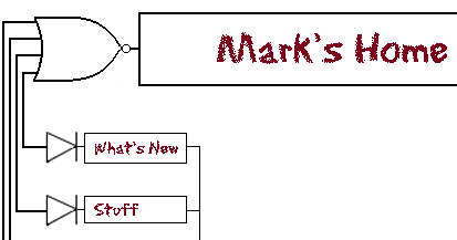
- 1997-1999: As I started to take computer programming courses in college, I gained access to a student account on the university website. By default, all student accounts came with a bare-bones homepage which we were encouraged to personalize. I never really did much with it, though I thought it was funny to see some of the courses I was taking back in the day: MAT 1050 – Who cares about math, and HIS 3140 – The History of the spork. Also of note, the fact that we referred to it as “electronic mail address” and that google was not on my radar yet… Sometime during this timeframe I started considering a more comprehensive “homepage” and made a few stabs that never really got beyond the photoshop stage (thankfully for you!). Among these ill-fated designes included the uber-nerdy logic gate design shown below (click for larger, more complete version):
I’m not really embarrassed so much at the logic gate aspect of the design (which I thought was mildly clever at the time) as the font choice. Gah. Anyway, it was during this timeframe that the first designs for a site called Kaedrin started. The first drafts of the now iconic (well, to me) Kaedrin logo were created during this timeframe. They were not used, but every logo since then has used the same Viner Hand ITC font, though these days the logo isn’t quite as prominent as it once was (as you’ll see below).
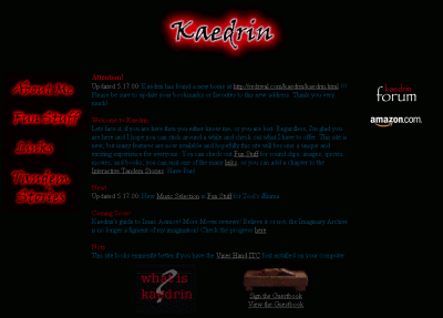
- May 1999 – Kaedrin v1.0: Again, I’ve had difficulty pinpointing the exact date when I launched Kaedrin in earnest, but judging from the timestamp of the first entry in The Rebel Fire Alarms, I gather that the site had been fully launched in May of 1999 (just as I was finishing up the semester and had some free time on my hands). Thanks to my participation on 4degreez.com (which may have been known as the T.A.S. Boards at the time, I don’t remember exactly), I immediately had a built-in audience of like 5 people, which was pretty cool at the time. That summer was filled with updates and content (this was before blogs, so updates came in the form of reviews for books, movies, and music amongst other stuff that was popular on the web at the time, like sound clips and funny pictures, etc…). The layout initially featured mostly red text on a black background, but I found that to be a bit hard on the eyes, so in August I tried to soften the colors a bit (though even the new color scheme was pretty tough on the eyes). I can’t seem to find an example of the full red on black, but here’s the tweaked version (Click the image to see the full HTML page).
For the full effect, you have to click through to the HTML page and mouse over the left-navigation. Back in the day, CSS support was minimal, so to do those rollovers I had to write a custom javascript. I don’t think any of the links off the page will work, but it’s worth viewing just for the fun of it. Also worth noting: the copyright logo animated gif thingy and the fact that I had a guestbook (which was all the rage back in the day). Finally, if you have a high resolution monitor today, it’s difficult to notice, but at 800×600 the Kaedrin logo is enormous!
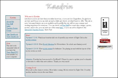
- May 2000 – Kaedrin v2.0: After graduating college and initiating a job search, I decided that the old homepage design wasn’t very professional looking. During the course of my Senior year, I had spent time learning and thinking about usability and accessibility, and my site at the time was not especially great in those respects (i.e. I figured out for certain that dark red and blue text on a black background was a bad thing). Also, being stuck with a modum connection (after the school’s snappy T3 lines) made me more acutely aware of page loading speeds (and the old page was rather image heavy). So I came up with a much cleaner and simpler design (Click the image to see the full HTML page).
This was certainly an improvement and when I eventually did find a job, my boss mentioned that she liked my site, so mission accomplished, I guess. Unfortunately, a “much cleaner and simpler design” also meant a more boring design, so it wasn’t long before I started fiddling around with the layout again. This was a little vexing because I was maintaining all of the pages on the site by hand, and converting to the new layout was a monumental pain in the ass. As such, many of the design tweaks made during this (rather short) era were inconsistent throughout the site.
- July 2000 – Kaedrin Weblog launched: The summer of 2000 is also when I discovered weblogs (the yellow-heavy designs of dack and kottke were my first exposure to the world of weblogs) and the relatively new Blogger. I remember being amazed at the fully featured blogging software that these crazy Pyra people were giving away for free! It’s easy enough to pinpoint my first blog entry, but to be perfectly honest, I’m not sure what the design of the blog was like. It was probably something along the lines of the v2 design, but I’m also virtually positive that the v3.0 design was pioneered on the blog, due to the fact that Blogger was something of a light CMS in that I could tweak the design for all blog pages rather easily. I do vaguely remember having a lot of issues with my free web-hosing company (at the time, I believe it was someone called “redrival”), and in particular their ftp sucked. I think there was a time when I would write an entry on Blogger, publish it to one free host, then transfer the code over to the new host. This is perhaps part of why the initial months of the blog were somewhat sparse in terms of entries, but things got going pretty well in September 2000 and I posted a record-high 29 posts in December 2000.
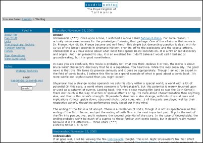
- November 2000 – Kaedrin v3.0: Due to the blandness of the the v2.0 site and the fact that Blogger provided easily updatable templates, I came up with a different design. It was still clean and simple and ultimately it didn’t last too long because it was still pretty boring. In fact, I’m pretty sure I never got around to updating the entire site. Just the homepage and the blog got this new design. (Click the image to see the full HTML page).
Ultimately not that much different than v2.0 (I suppose you could consider it more of a v2.5 than a new version, but then it’s probably different enough). It’s still got the big honkin Kaedrin logo, but for some reason I liked this better.. and there’s also the first appearance of the “You are here” bar at the top of the page. While I liked this design better than v2.0, I wasn’t very happy with it and almost immediately started working on something new. I was also getting pretty well fed up with hand coding all these pages for what amounted to minor layout tweaks. One thing that helped in that respect was Blogger, which worked like a CMS-lite, allowing quick and easy layout changes with the click of a mouse. Here is the first design for the blog that I could find. (Click the image to see the full HTML page).
Interestingly, it seems that I decided to forgo the Kaedrin logo in favor of a little HTM text thingy. Also, I had completely forgotten about the blog’s original subtitle, which could use some explaining. Back in the 1990s it was popular to use “handles” instead of your real name. When I first started posting to message boards and the like, I absent-mindedly chose the moniker “tallman” because I was a big fan of a certain cheesy 1970s horror movie that featured a character who went by that name. Since a lot of popular blogs at the time had playful titles like Boing Boing and the like, I went with “The Royal Kingdom of Tallmania”. I have no idea what possessed me to do that, and it wasn’t long before the subtitle was dropped in favor of just “Kaedrin Weblog”.
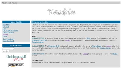
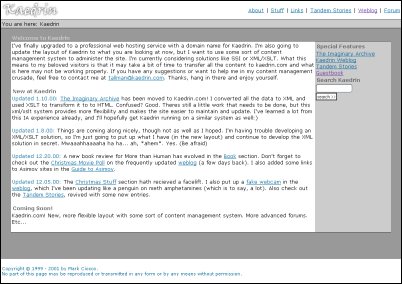
- January 2001 – Kaedrin.com and v4.0: After dealing with the hassle of free hosting companies, I finally realized that I had a steady income and could probably afford a professional hosting service and a real domain, so I bought kaedrin.com and started work on a new design. Fed up with manually coding redesigns, I devised a kludgey XSLT solution that allowed me to completely separate content from design. So I put all my content into XML files and coded the new design into some XSL stylesheets. This design may look somewhat familiar (Click the image to see the full HTML page):
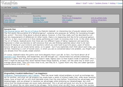
Being obsessed with download speeds and page rendering, I devised an interesting layout for the blog. Instead of using the typical single-table design, I put the blog navigation at the top (instead of to the left or right) and I put each entry in it’s own table. The idea was that browsers render content as it’s downloaded, and if you have a large table with a lot of content, it could take a while to load. So having a series of smaller tables on the page, while increasing the size, also make the page seem to load quicker. All in all, I rather liked the look of this layout, though I don’t think it’s something I’ll be returning to at any point (Click the image to see the full HTML page):
While I like what I was able to do with that navigation at the top, I think there were ultimately more things that needed to go into the navigation and that space just couldn’t fit it. I broke down and put it all in a big table in later designs (see below).
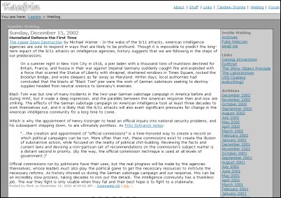
- July 2002 – Movable Type: After a couple of years, I had finally gotten fed up with Blogger’s centralized system. Blogger was growing faster than they could keep up with, and so the service was experiencing frequent downtime and even when you could access it, it was often mind-numbingly slow. Around this time, a few other solutions were becoming available, one of which was Movable Type (I started with version 2.x – also, it’s worth mentioning that WordPress was not available yet). This solution increased functionality (most notably bringing comments into the fold) and provided a much stabler system for blogging. The design changed to take advantage of some of this stuff and to make my blog more consistent with certain blogging standards. This one should look really familiar (Click the image to see the full HTML page):
That’s basically the same design as today, except for the date and some of the junk in the right navigation.
- And from there it was a series of tiny, incremental improvements, upgrades, and design tweaks. It’s funny, I didn’t realize until now just how little the site has changed since 2002. Also funny: the fact that I had finally devised a way to make redesigns a lot easier (i.e. my xslt solution) and basically stopped redesigning. Then again, it came in really handy when I wanted to do some little things. For instance, the original v4.0 design didn’t have the same borders around the main content area that I use today (it did have a small border at the top of the area, but it was barely noticeable and it was coded using spacers – yuck). I suppose the grand majority of the work that I’ve done has been behind the scenes: upgrading software, switching databases, fighting spam, and did I mention upgrades? In 2004, the main homepage was updated to account for the fact that the grand majority of the updates on the site were coming from the blog, and the design has remained largely unchanged since then. Around the same time, I tried to make sure the blog and homepage were valid HTML 4.01 (this is perhaps not the case for every page on the blog, as I’m sure I missed an & somehwere and of course, embedding video never validates, but otherwise, it should be pretty good).
- Of course, the big visible thing that I was doing all throughout was blogging. When I started out, technology made it somewhat difficult to update the blog. Eventually I got Blogger working with my host at the time and enjoyed 3 months or so of somewhat prolific blogging. Of course, at the time, I was posting mostly just links and minor commentary, and this eventually trailed off because others were much better at that than I was. December 2000 is still my most prolific month when it comes to the number of posts (29 posts that month), but again, those were mostly just links and assorted short comments. From there, things trailed off for a couple of years until May 2003, when I established my weekly posting schedule. This made the blog a bit more consistent, and gradually, I started to find more and more visitors. Not a lot, mind you. Even today, it’s doubtful that I have more than a few dozen semi-regular visitors (if that many). Actually, if you’re reading this, you probably know most of the recent history of the blog, which basically amounts to at least 2 posts a week.
Whew, I didn’t realize that trip down memory lane would take quite so long, but it was interesting to revisit just how tumultuous the design was in the early years and how it has calmed down considerably since then… Hopefully things will continue to improve around here though, so what kinds of things can you expect in the near future? I have a few ideas:
- CSS Layout: The site currently uses a table based layout, primarily because it was designed and coded in 2001 and browser support of CSS was pretty bad back then, so CSS layouts weren’t really an option. In 2007 (has it really been that long), I put together a mockup of the site using CSS layout, but never got around to actually implementing it. There were a few things about the layout that were bugging me and I never found the time to fix them. Someday, I’ll dust off my mockups, finalize them, and launch them to the world. Having a CSS layout would also allow me to optimize for other media like cell phone browsers, print (my goal is to make it easier to read Kaedrin on the can), the Wii browser, etc… None of those things is a particularly burning need, which is probably why I’ve put this off so long…
- Weblog Post Designs: I’ve never really been too happy with the way each post is laid out. For one thing, I feel like I’ve always given too much prominence to the date – which is something I could probably just remove. Also, the post title should perhaps be a bit larger (and be linked to the permalink).
- Homepage: The homepage has largely become irrelevant and should probably just redirect to the weblog, as that’s where 99% of the content is these days. Again, this doesn’t seem to be a burning need, so I haven’t spent much time looking into that, but it would be pretty easy to accomplish.
- Comments: The comments functionality is a bit of a mess and could use some work.
- Post Content: I feel like I’ve been in a bit of a rut lately, mostly relying on various crutches like movie reviews, etc… and not writing as much about things that really interest me. Not that movies or video games don’t interest me, but I used to write more posts about technology and culture, which is something I’d like to get back into. The issue is that those posts are a lot harder to write, which I think is part of why I’ve been avoiding them…
So there you have it. Ten years of Kaedrin. Hopefully, it will last another ten years, though perhaps it will be in a completely different format by then… If you have any comments, questions, or suggestions, feel free to leave a comment…
Congratulations on keeping the site updated for 10 years! That really is quite the feat.
It was fun seeing all the past designs. I had forgotten all about the black background and the red aura around the headings. You were so cool back in the day, but then you sold out…
=P Just kidding. I like your current design, but I’m sure you’ll change it up in the future.
(I tried posting this once, and it didn’t seem to work. I hope I’m not double-posting.)
Double poster!
Yeah, I had a lot of fun digging up all the previous designs and trying to figure out the timeline. Some of that older content is… not so great… but it was fun anyway:)
Damn, I don’t know why my comments weren’t showing up for me.
There was at least one other woman regular at one point right? I can’t remember her name. Did she come from 4degreez?
There were a few, IIRC. I want to say someone named empyrean and I remember blueberry jane and a couple of others too. Mostly from 4d (though I’m not really sure who BJ was)… many didn’t stick around…
I remember rebel fire alarms. That was a long time ago. I still drop by occasionally, too.
Hey grenville! Long time no see:) Yeah, those original tandem stories were a lot of fun. It’s hard to believe they’re so old!